Experiment: Multiline carousels
Setup
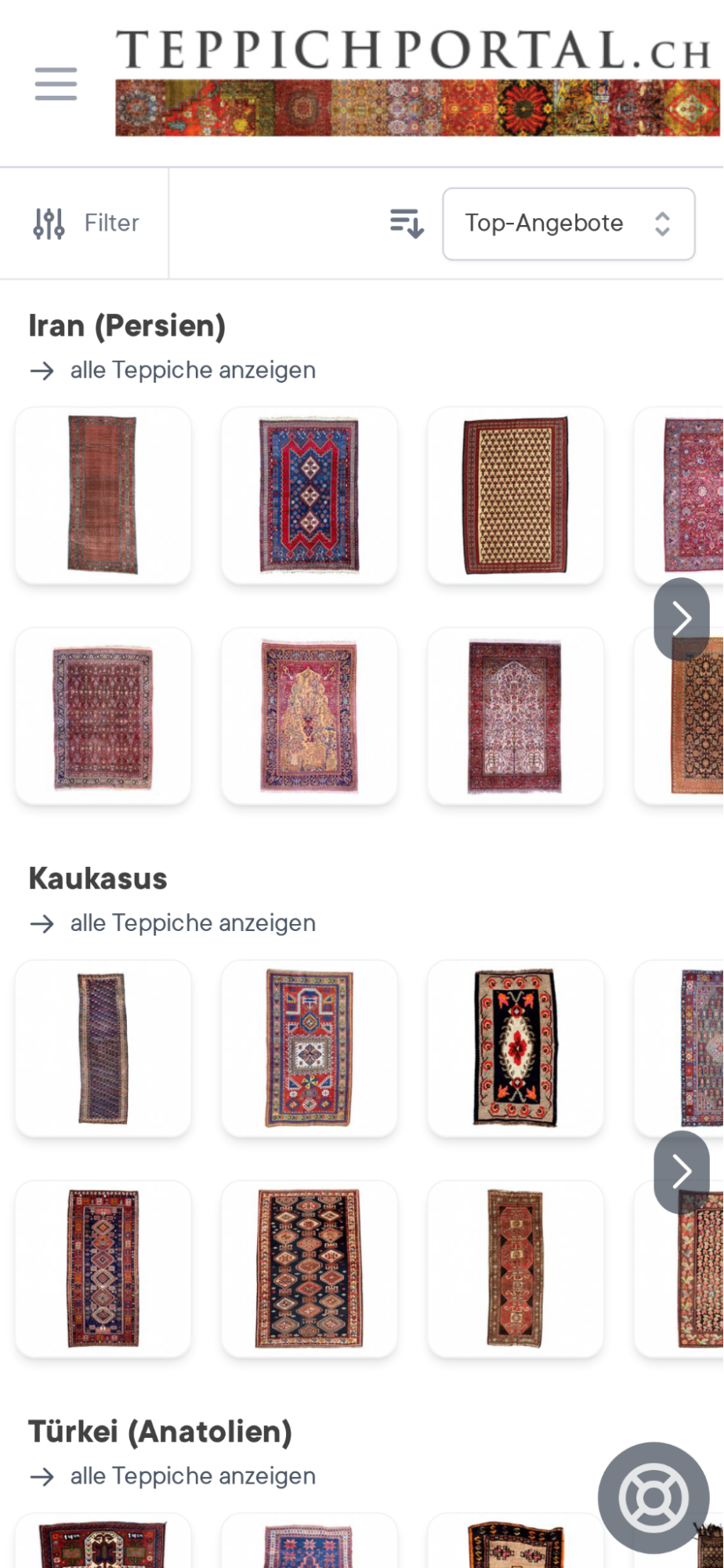
Our hypothesis here is that the reason carousels did not work well on mobile (cf. this experiment) is that users see only one and a half random result for a given aspect, which is not very inspiring. With this experiment, we tested the idea of showing more results within the carousel by organizing the results into two lines and using smaller thumbnails.
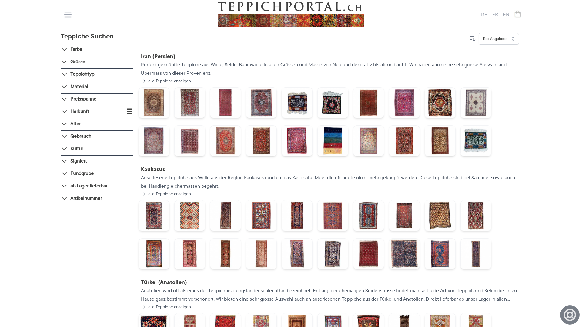
Our expectation is that this setup is worse on desktop than single line carousels.
Mobile

Desktop

Results
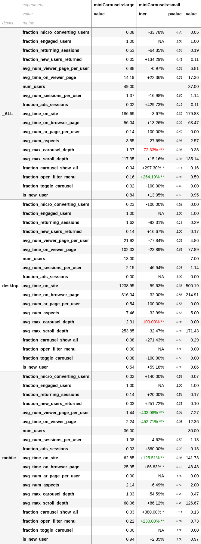
- mobile more engagement
- desktop worse than large
- we should combine the two: mobile multiline carousel (with description), desktop single line carousel (with description)
