Carpet Shop: A holistic approach
We have been working with a local carpet shop during the summer of 2022. The focus of our holistic treatment (website + search ads campaign) was to improve their discoverability and optimize the conversion funnel.
We've identified the following issues:
- Ads Campaigns: 75% of the cost goes to useless search terms that are unlikely to result in conversions.
- SEO
- the main shop and services have good coverage
- implementing categorical pages is a great opportunity to acquire mid-funnel traffic
- Frontend
- many visitors but low rate of conversion
- needs overall funnel optimization to increase engagement
- search UI difficult to use on mobile
- very slow page load, difficult to explore
Experiments
The only way to create a well-performing website nowadays is through rapid experientation with the organization and presentation of the content. We have started with a couple of small-to-medium sized feature ideas, implemented them and launched them in an A/B experiment setting in order to understand their impact.
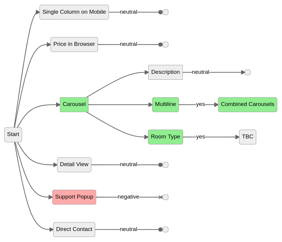
This flowchart shows the experiments that we've run along with their outcome. Iterating on the successful features, we've built up a combination of new features that significantly drive user engagement (see the greeen boxes).

Preparation
In order to run all these experiments, we had to modernize the frontend of the website and lay down the fundamental building. Read more on the technical details of Carpet Shop's New Architecture.
Sprint I
In the first round, we ran 3 parallel experiments:
- Carousel: grouping results into aspects carousels instead of grid
- Single Column on Mobile: use single column grid on mobile instead of 2
- Price in Browser: hide price
The strongest results came from the carousel experiment: while the desktop engagement was trending positive, the mobile slice was significantly negative. The message was clear: mobile users don't like exploring via these carousels.
Sprint II
Following up on the learnings from Sprint I, we wanted to find the way we can make carousels mobile friendly.
- Carousel with Description: give textual context around the carousel content.
- Multiline Carousels: show two rows of smaller images – mobile friendly carousel
- Detail View: start with a close-up photo of a carpet's pattern
- Support Popup: a lean experiment for getting users into a guided search mode
- Direct Contact: the
Add to Cartbutton was replaced with a direct call (WhatsApp / Phone) button.
We had clear results again:
- The multiline carousels work really nice on mobile. The way to go is to combine the normal carousels for the desktop and the multiline on moblie.
- Support Popup turned out to be a disturbing idea. This is clearly not the way to invite users into a guided experience.
Sprint III
Another idea to increase user engagement was to provide some soft filters for navigation as opposed to the factual filters like carpet origin, type or size.
- Room-type Carousel: let the users restrict carpets to living room, etc.
This experiment showed very strong improvements in engagement.